
Innovation
Case
How design can increase audit impact: experiences from an auditor who designs
September 2, 2020
Tags: audit impact, design, people centered
In this piece Linda Meijer-Wassenaar shares her ideas on using design-led approaches in audits, based on her own experiences as an external auditor who designs. Designers focus on what works, auditors focus on the truth: in other words, human-centered versus content-centered. Linda believes that combining these two approaches will increase the impact of your audit.
Highlights
- Design-led approaches can be used in audits to increase impact
- Working as a designer asks an auditor to step out of their comfort zone
- Designers and auditors can work together to get the best of both worlds
Auditors dig deep to find the truth. Once above ground, they thoroughly write up their findings and report to their stakeholders. Designers on the other hand start with the stakeholders: what do they need? How can we reach them? Once you combine these two aspects, you can design audits that both reach your audience and do justice to the content. But it even goes a step further: by acting like a designer throughout the entire audit, stakeholders will be more engaged and the content becomes more useful and accessible. And that is what we need in this time of information overload!
Basic design principles
To put this into practice, you should apply the three basic principles of design: working iteratively (small testing cycles), making information tangible (e.g. using visuals) and putting the human in the center. How is this way of working different from auditing?
- In audits, we work linearly: a defined path from plan to report. However, designers work iteratively: one prototype follows the other. Each prototype contains small changes, based on reactions. This results in a product that works, but don’t let the simplicity of the design fool you.
- In audits, most auditors tend to work with words, a lot of words. In my thesis I found that a lot of auditors prefer visuals as well (auditinvorm.nl, 2018). Auditors said that they don’t think they are very good at sketching, they lack the right software or they just forget about it during the audit as everyone is so focused on the text. Yet, making something visual (or even tangible) helps to get new insights and a shared image of the topic.
- In audits, the content is the main focus. I will stay away from any philosophical discussions on the dominant paradigm in the work of an auditor, but if you forget the human in your work, you might miss big opportunities to have impact.
How can you use these design-led approaches as an auditor? Let me share some examples from the Netherlands Court of Audit.
Case 1: Information provision social services
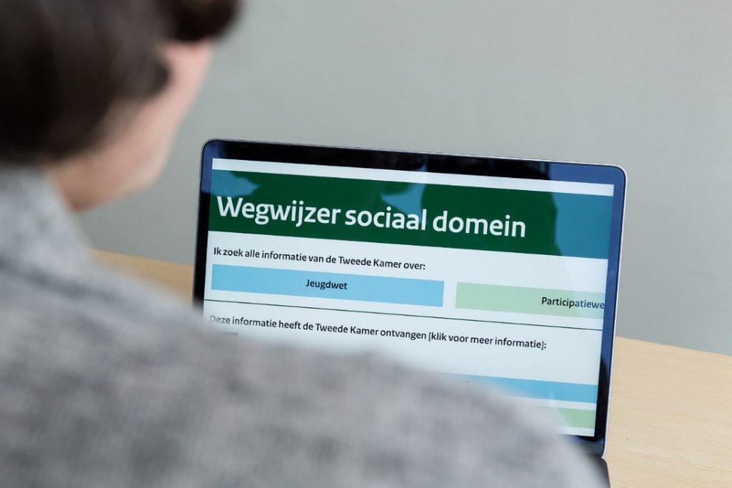
In our audit on information received by Parliament on social services (care for children, elderly, etc.) the team decided to not only explain to Parliament what information it should receive by law but also how the information received could be presented in a more accessible and useful way. We designed an interface to present this, testing the prototypes firstly on the support staff of parliamentarians (as they prepare the debates) and secondly on members of the research unit of the Parliament. This way of working allowed us to publish a ‘Social Domain Signpost’. We designed the Signpost as a suggestion to Parliament for better information provision and it was received enthusiastically.
Case 2: Revolving funds
In our audit on revolving funds our main goal was to explore this relative new financial instrument. As Parliament lacked information on this instrument, we came up with the idea to develop factsheets on the 24 revolving funds. Our first sketches led to a factsheet that contained 6 visual stories.
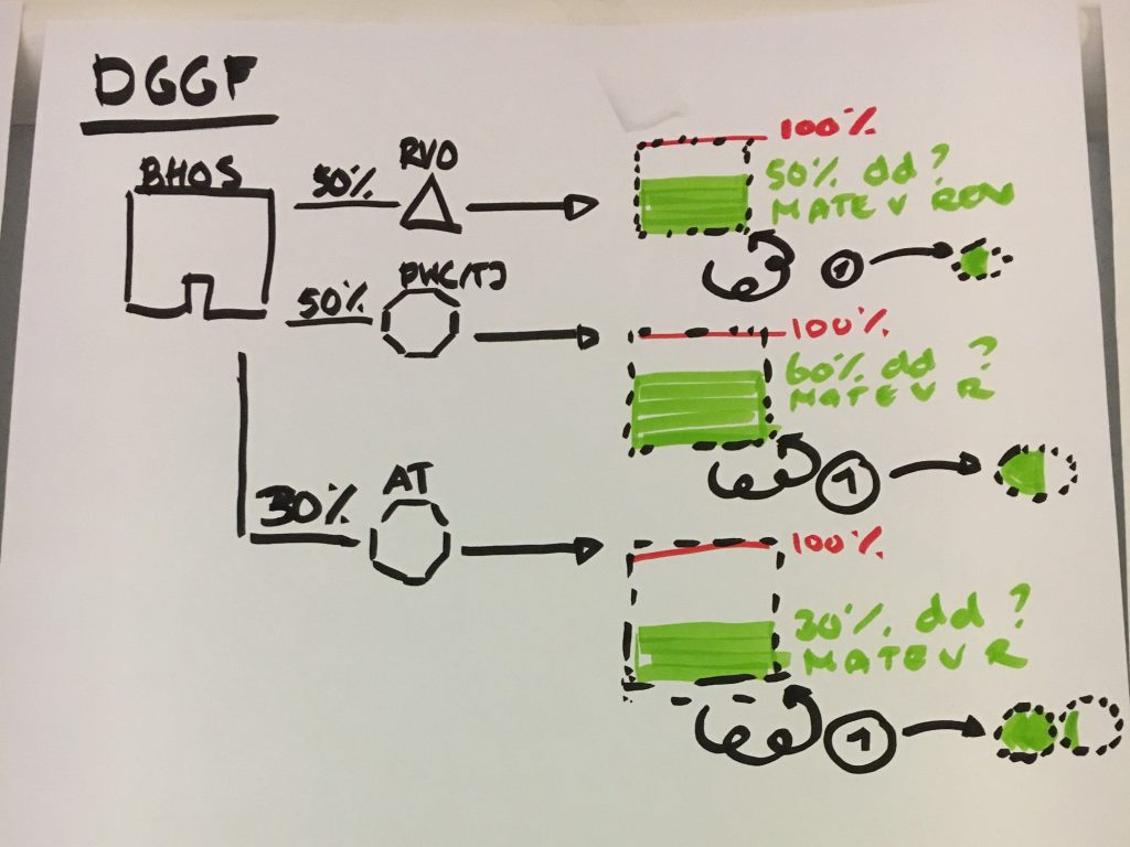
We invited policy makers, experts and colleagues to give feedback on the prototype of the factsheet. Most participants had to quickly shift their mind set when they were not asked to respond to the facts (they would get to that later in the process) but to tell us ‘does this way of presenting the information work for me?’ They were then invited to draw and comment on the prototypes. We deliberately presented the prototype on whiteboards, so participants could stand around it to discuss and felt invited to react while the prototypes did not look finished.
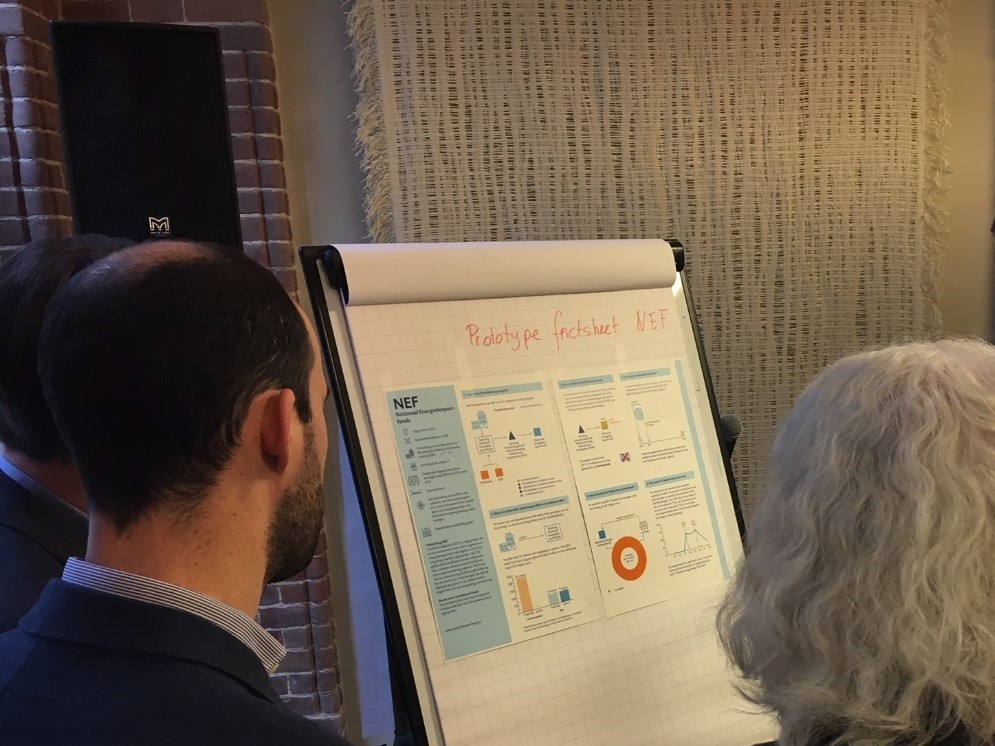
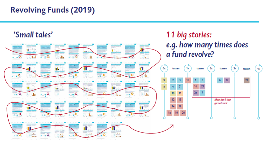
This resulted in 24 factsheets that were tested and published as an example for ministries to report on revolving funds to Parliament. The 24 factsheets also enabled us to come up with 11 infographics which we used in our report (small tales that added up to big stories).
Case 3: Grip on data
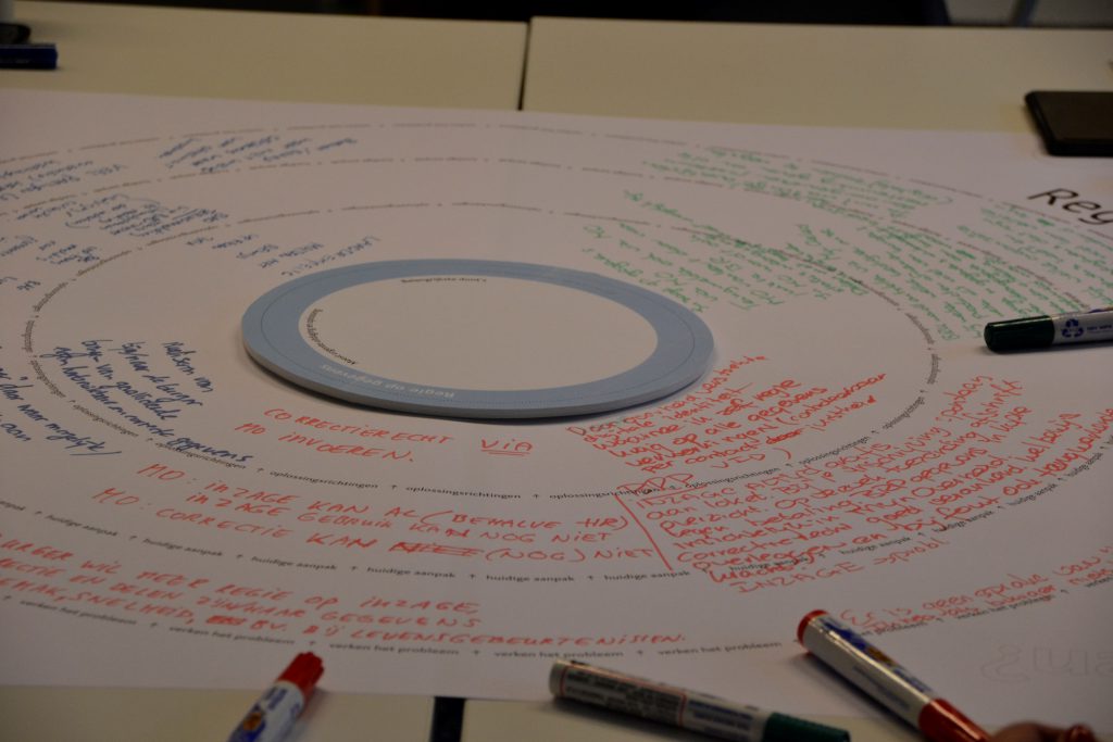
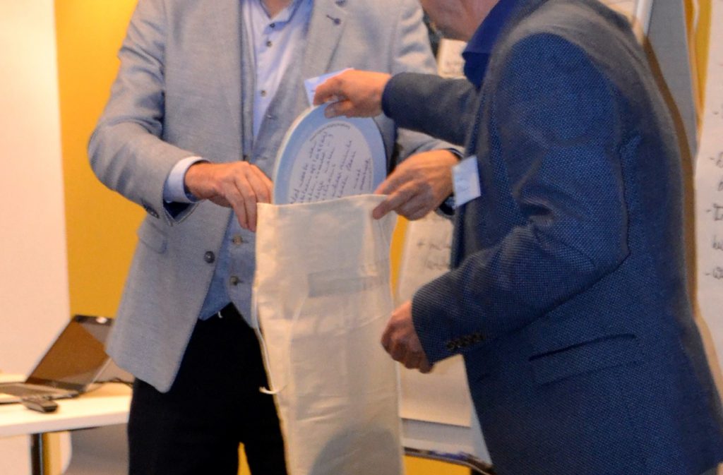
One of the recommendations of the audit report of the NCA on the system of basic registrations of data on people and companies in The Netherlands, was to improve the cooperation between 10 agencies, each responsible for a ‘key data register’. Wiesje Korf, design researcher at the NCA, together with auditor Iris Korthagen designed a “tablecloth exercise” that invited participants to take part in four discussion rounds. The discussion started with identifying a common challenge and ended with formulating a common solution. Each table would ‘chip-in’ by putting the centre (a chip) in a bag which collected all ideas how to improve cooperation. “Chipping-in” is based on a Dutch saying that translates as “put a penny in the pocket’.
Conclusion
These are a few examples of how you can combine designing with auditing. Working iteratively, visually/tangibly and human-centered might ask you to step out of your comfort zone. But most stakeholders were very positive about our new way of working. They really appreciated that we put effort into making complex information tangible/visual and that we involved them during the audit process. We are still learning how best to use design-led approaches in our audit work, doing justice to the content without losing our independence as a Supreme Audit Institution. We look forward to meeting others experimenting with this way of working!
| About the expert Linda Meijer-Wassenaar works as a design researcher and senior auditor at the Netherlands Court of Audit (NCA). She initiated the Design Audit Studio, a team of 4 design researchers based in the NCA, to support the use of design-led approaches in audits. Next to the studio, a pool of 6 external designers is on call to execute a diverse range of infographics and visual stories. Linda has a background in sociology (MSc, 2007), and completed a MA in Design Research at an art academy (2018, auditinvorm.nl). Linda has worked at the NCA since 2008, started to design in 2013 and initiated the Design Audit Studio in 2018. Wiesje Korf, Lizet van Tilburg and Diny van Est all work at the Design Audit Studio. |
The views in this article are the author’s only, and do not necessarily represent the views of the OECD or its member countries.
Let’s Discuss
Innovation
- You must be logged in to reply to this topic.

